The Original Brand
There was several areas in need of improvement needed for the original Brewster’s Brewing brand. The logo lacked refinement and didn’t align with the company’s vision. The color palette was another key area for development, as it failed to evoke the desired Canadian experience. Additionally, the lack of clear differentiation between flavors made it difficult to distinguish one beer variety from another. These issues became the foundation for creating a more unified, impactful, and versatile brand.
Fresh New Look!
With the challenges of the old brand in mind, I set out to redefine Brewster Brewing CO. with a clearer vision and cohesive identity. Establishing the design direction and color palette was the first step toward setting the tone for a refreshed brand. The logo, as the centerpiece of the identity, demanded special attention. It needed to be bold, memorable, and resonate with the audience.


The Path to The Final Logo
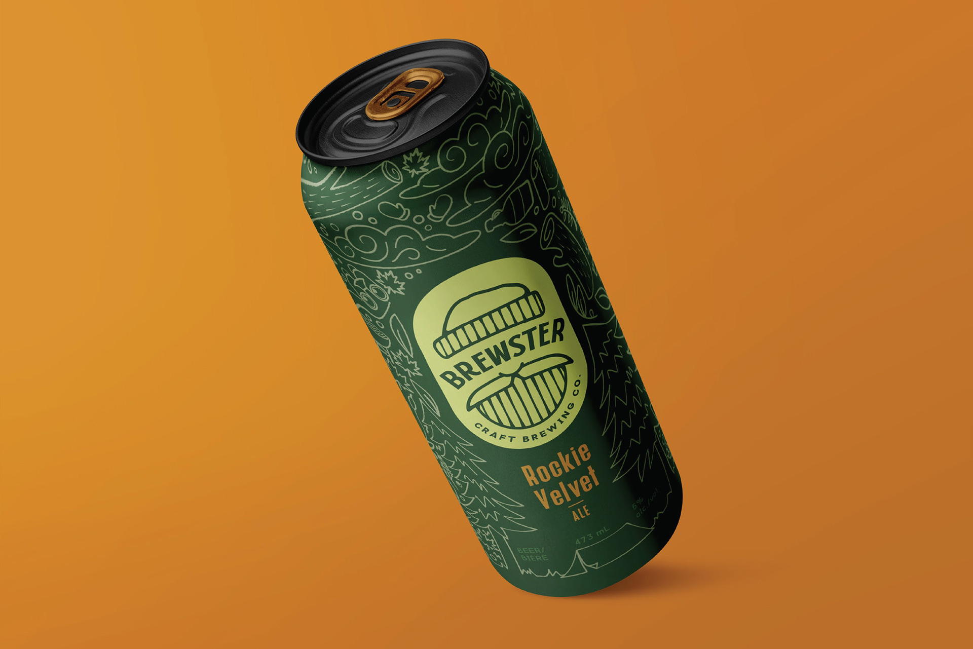
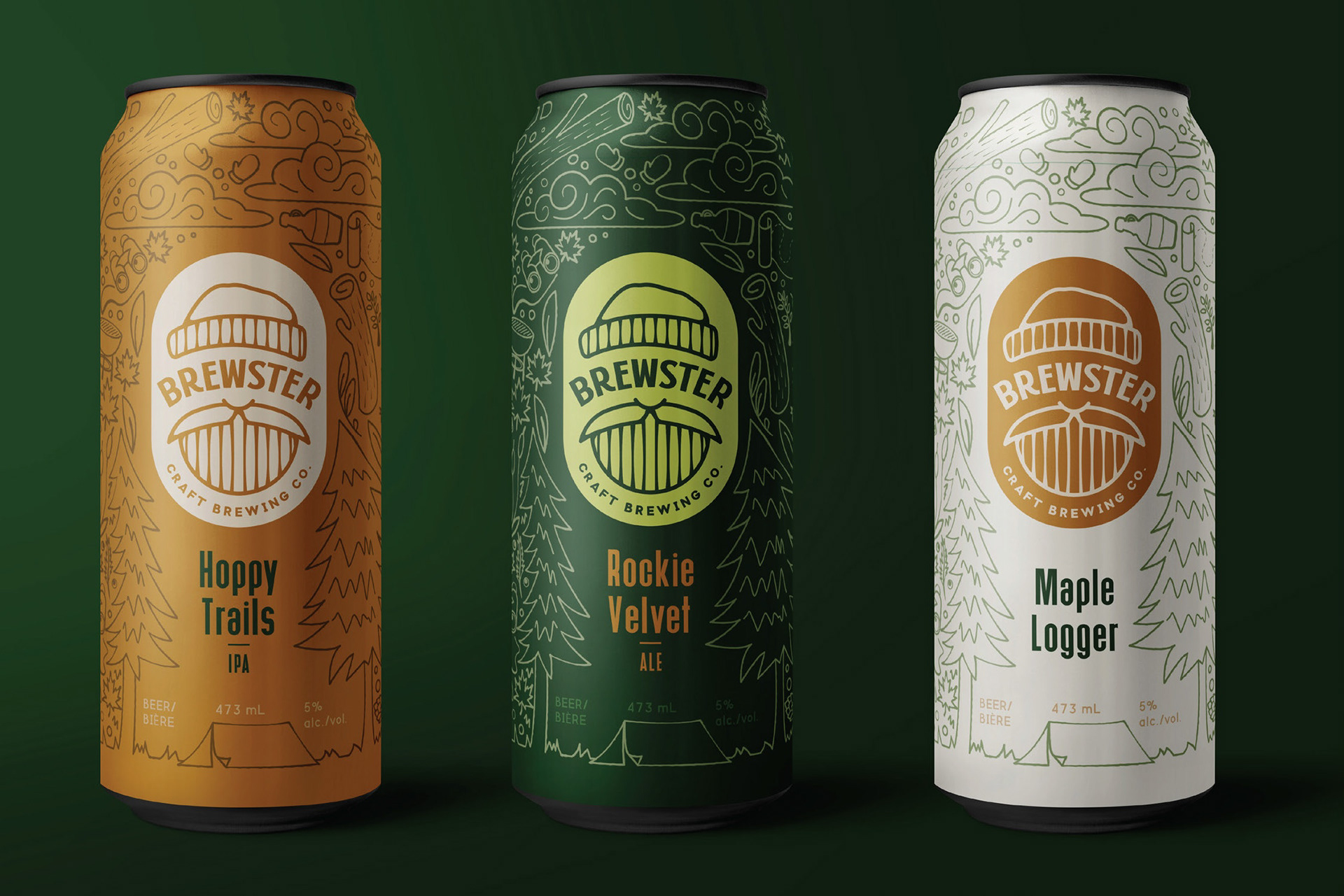
Through sketches, I honed in on the figure of the lumberjack—a symbol deeply ingrained in Brewster’s identity. Taking inspiration from the original mascot, I simplified and refined the design, creating a modern, streamlined version that embodies adventure and the Canadian spirit. This process established the cornerstone of Brewster Brewing CO. refreshed look and feel, bringing every element together with balance and clarity.
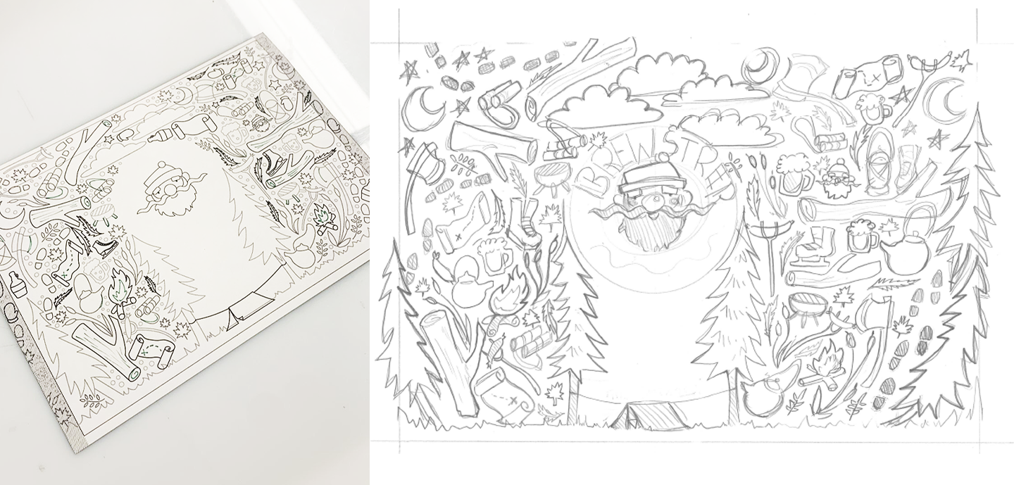
initial motif mapping
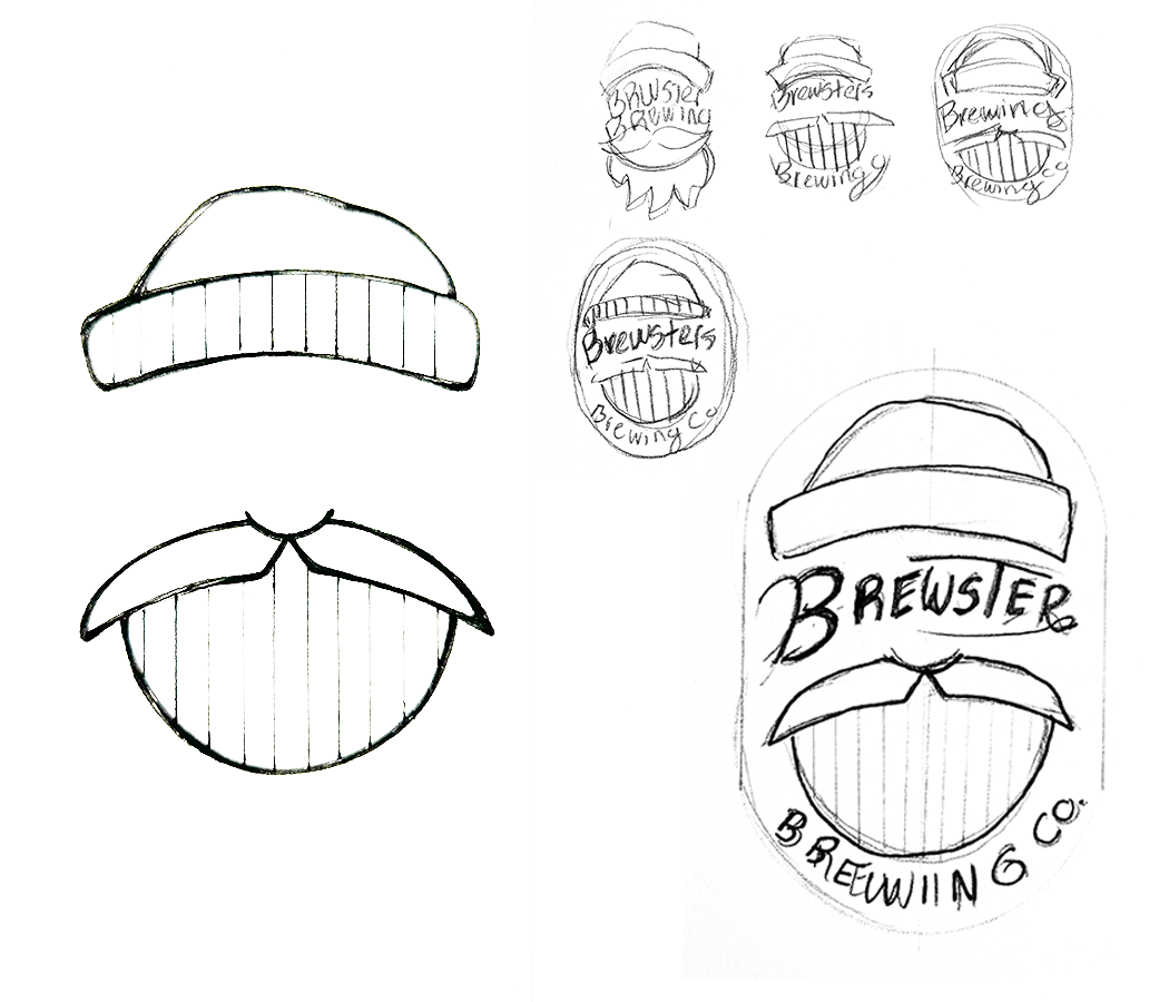
Reworking brewster brewing co. Logo
Brand Guidelines
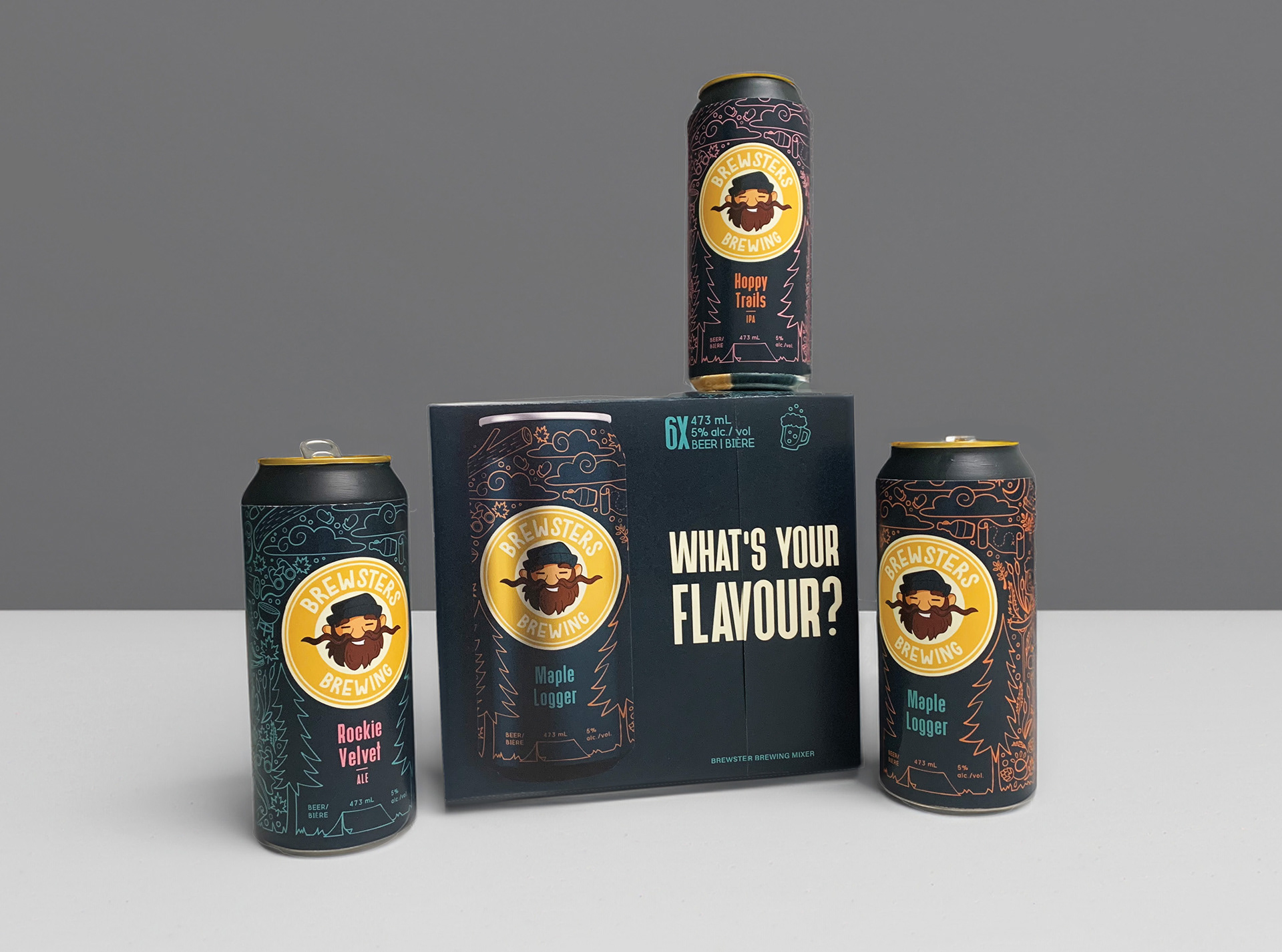
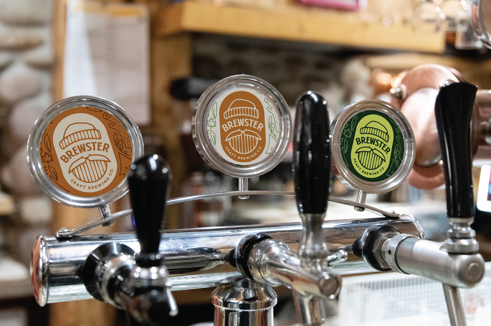
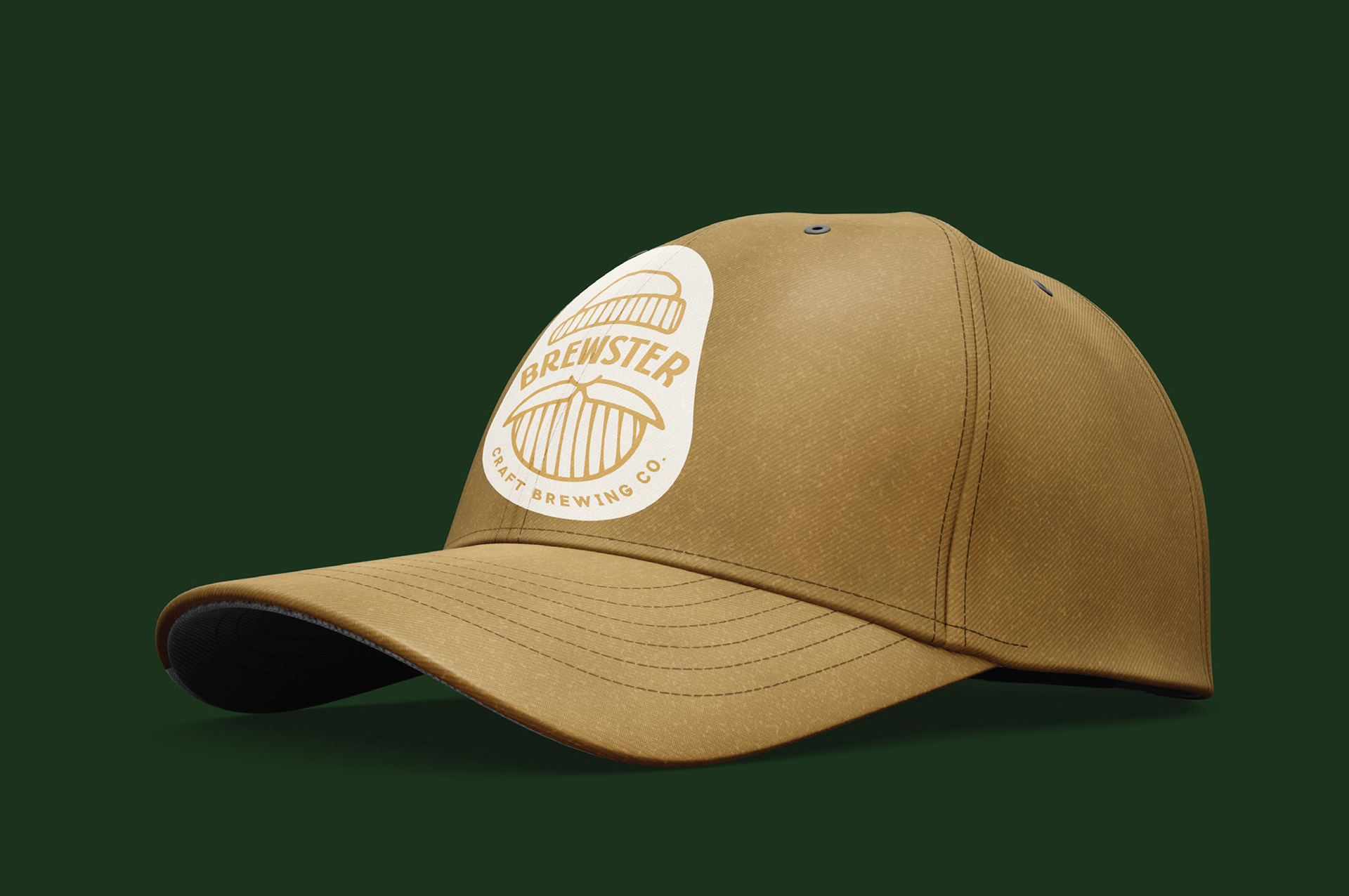
Are essential for ensuring a new identity is understood and used consistently across all platforms. For Brewster Brewing CO, I developed a comprehensive guide to align the refined brand elements with the company’s vision. This included a brand rationale to communicate the updated story and tone to partners and clients. To bring the brand to life, I created several applications, including a six-pack craft beer case featuring their three flavors, showcasing the versatility of the new identity.
Have a project you
want to work on?
Thank you! I will be in touch soon!