
Fresh New Look!
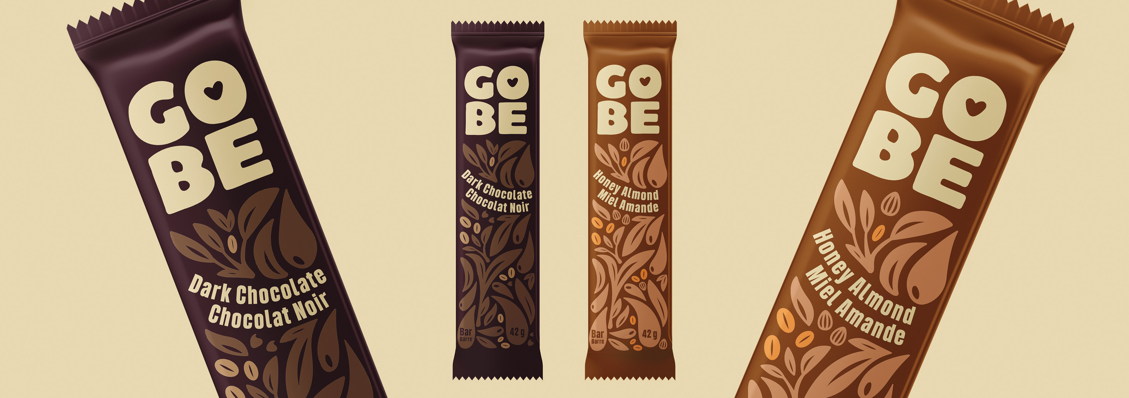
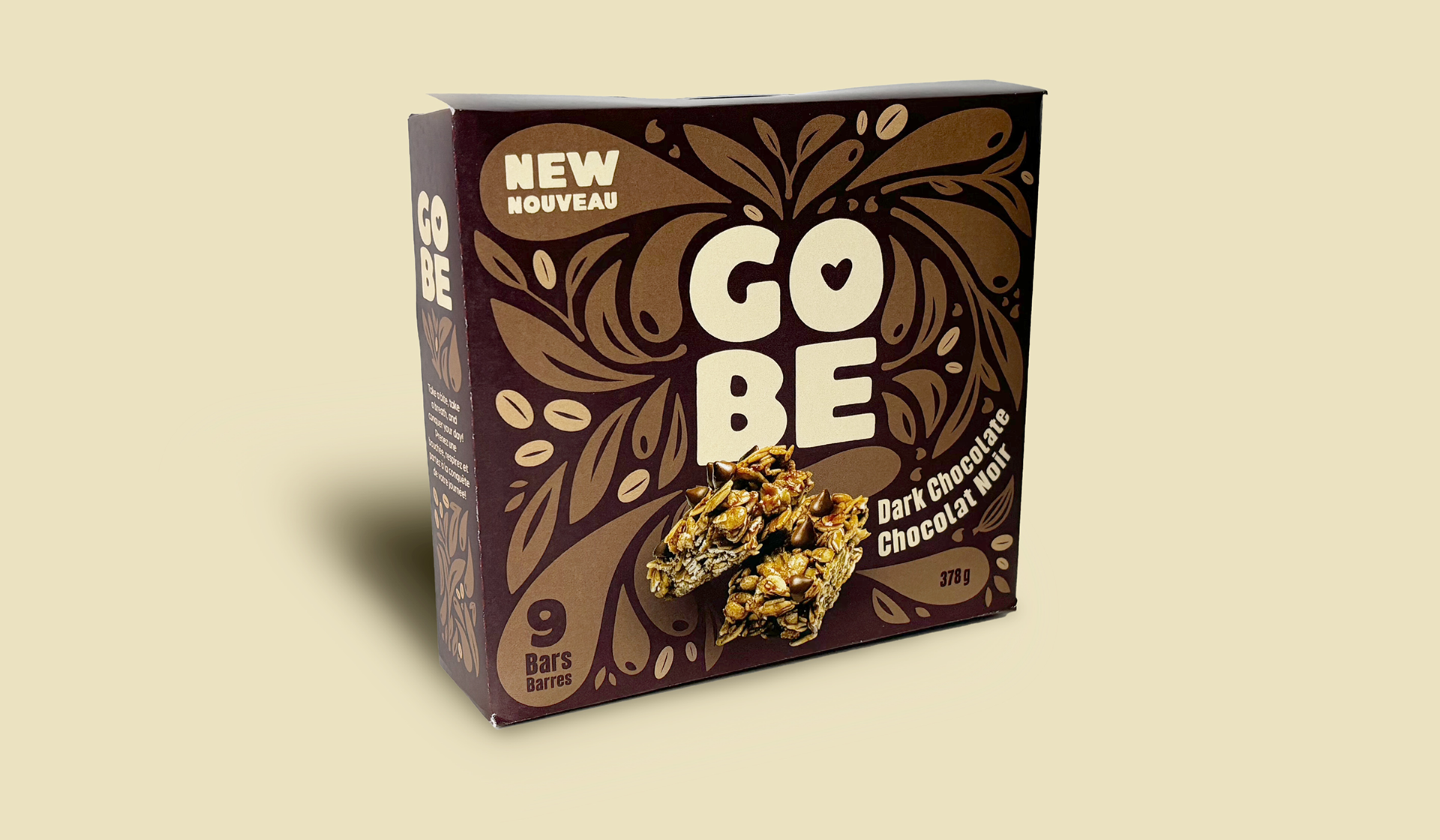
For the visual identity, a minimalistic approach was taken with a color palette consisting of off-white and bright orange. The off-white serves as a base, symbolizing purity, calmness, and balance, while bright orange adds energy and joy, reflecting the enthusiasm that comes with progress and success. The logo was designed to be the focal point of the packaging, placed at the center to create a target-like effect that directs the consumer's attention. This centering tactic reinforces the brand’s core message of focus and intentionality, leading the consumer's gaze straight to the brand name, ensuring easy recognition and connection.
The overall design is characterized by clean, modern typography and flourishing, plant-like elements, symbolizing growth and vitality. These detailed visual motifs not only enhance the aesthetic of the packaging but also mirror the brand's philosophy of flourishing personally and professionally. GOBE stands out as more than just a snack—it’s a visual representation of the journey to self-improvement and the joy that comes with it. Through these design choices, GOBE successfully establishes itself as a brand that supports the consumer in achieving their best self.
Have a project you
want to work on?
Thank you! I will be in touch soon!